
The Recovery That Never Cleared
The model is profitable out of sample on four of its five test windows and loses money on the fifth — a 2026 geopolitical volatility episode. The sizing work was still open, but that single loss bothered us enough to stop and take it apart first. A loss you can explain is worth more than wins you can't.
Three questions, in order
There were three ways to explain it: the edge is decaying over time, this event was anomalous, or the model needs different inputs. They aren't the same kind of claim, so we split them — is performance decaying over calendar time (a question about when), was this event specifically odd (a question about which), would different features fix it (a question about what to change) — and adopted a rule: answer the first two before reaching for the third. Changing inputs to repair a known failure is how you fit the past and mistake it for insight.
What the model saw
We compared the losing window against two clean wins (the late-2018 selloff and the 2020 crash), reusing the cached fits so nothing was refit. Two things came out.
First, the model had learned a different internal structure on the losing window — five regimes on the clean windows with a stress trigger at one level, but only four here, with a lower trigger. So it shot into its stress regime on a milder shock: the window's peak stress signal was about half the 2018 level and a third of COVID's, and its equity drawdown was roughly 8% against the references' ~17% and ~32% — yet it sat in the stress state for 59% of the selloff, more than 2018's 36%. A lower bar to fire plus a smaller shock equals over-aggressive shorting.
Second, and more important: the selloff wasn't where it lost. The recovery was.
The recovery had no all-clear
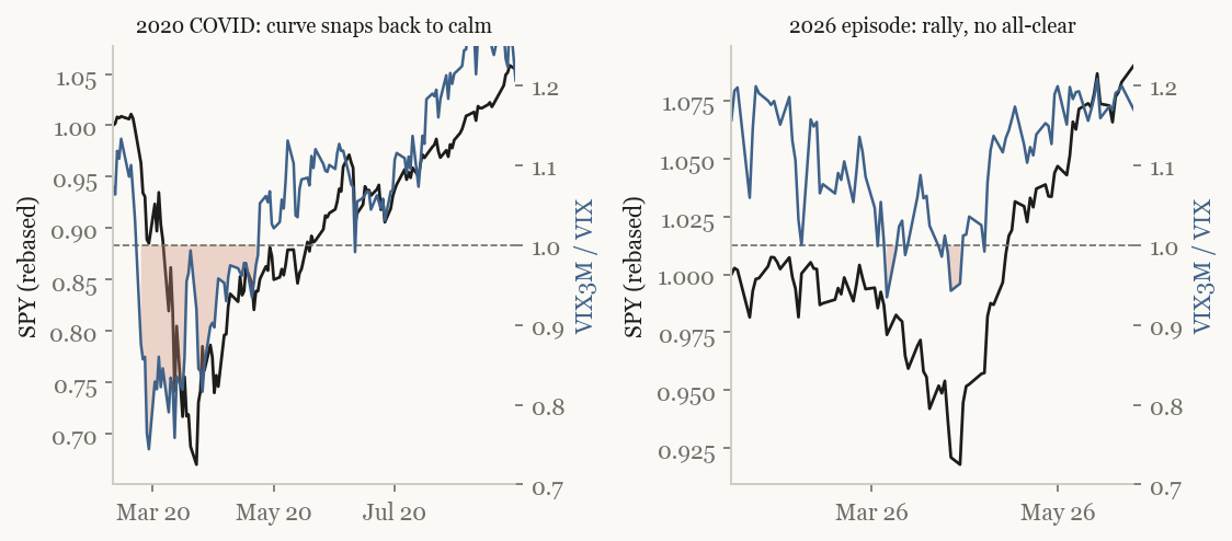
In 2020 the stress signal crashed to a deep extreme at the bottom and snapped the model out of its stress state within two bars. In 2026 the market rallied about 17% while the same signal hardly moved — there was no flip to read, so the model sat in stress through the whole recovery and bled.
Ruling out the easy answers
Two tempting explanations, both tested, both rejected.
The first was a hybrid: the correlation signal the model uses is direction-blind, so maybe pairing it with a direction-sensitive volatility signal would catch the recovery. Through the episode the two moved together — the second signal added no information the first didn't already have. Dead.
The second was sample size: post-2020 simply hasn't thrown enough stress at the model to learn from. We tested it by splitting every era into calm and stressed bars and scoring the signal separately in each, and it refuted itself decisively:
| Era | calm-bar signal | stress-bar signal |
|---|---|---|
| 2007–2014 | +4.7 | +4.8 |
| 2015–2019 | +5.0 | +5.6 |
| 2020–2026 | +1.2 | +3.8 |
The numbers are how cleanly the feature separates good days from bad (higher is better). The stress-bar column barely moves across two decades; the calm-bar column falls off a cliff after 2020. There were plenty of bars — over 1,600 calm bars in the post-2020 cell — and more crisis bars than the earlier eras, not fewer. So it isn't sample size. And in the calmest, highest-signal bucket the predictive sign actually flipped: the reading that used to precede strength now precedes mild weakness.
A signal on the wrong part of the curve
That points away from "the world broke" and toward something narrower. A wide screen across two dozen volatility-and-correlation features found that the model's single input sits on the most-degraded part of the surface, while others held their footing:
| Calm-bar predictive strength | pre-2020 | 2015–19 | post-2020 |
|---|---|---|---|
| the model's input (long-dated correlation slope) | +4.7 | +5.0 | +1.2 |
| a medium-term volatility ratio | +3.1 | +3.0 | +3.6 |
| a shorter-dated correlation slope | +3.9 | +4.1 | +2.8 |
The medium-term volatility ratio is actually at its strongest after 2020. So the recast is: the model leans on one feature, and that feature is on the worst-aged axis of the curve. The likely mechanism is that the surface aged unevenly — the very short end distorted by the rise of same-day options, the medium term left clean, and the long-dated implied-correlation axis the model uses distorted, plausibly by passive flows through long-dated index options.
Where it leaves us
Honest and unfinished. The diagnosis is a feature problem, not a model problem, and it suggests a fix — swap the degraded input for a less-aged one, or add a second beside it — but we have not run it, and one losing window is one data point (another post-2020 window, a 2025 tariff shock, was among the model's better results). The sizing work stays paused until this is settled. The useful output of the week is not a repair; it is knowing precisely what broke — and that it was less the market changing than our single window onto it.